Accessibility (a11y)
Decidim, just like the World Wide Web, is built for everyone regardless of individual abilities or disabilities, and for any software and hardware capable of connecting to the internet. Developing services in an accessible way ensures that the services can reach to audiences as wide as possible which is the most important principle of democracy.
Decidim follows the latest version of the Web Content Accessibility Guidelines (WCAG) but we have seen that these guidelines may be quite broad, complex, and hard to understand for many developers. The purpose of this guide is to provide some simple tips on how to follow the accessibility guidelines when developing the Decidim user interface.
Is it necessary?
Most websites built on Decidim are under different regulations that require these services to follow accessibility guidelines. Therefore, following the guidelines and making your Decidim-based websites accessible are often requirements, not suggestions. Any core contributions have to follow the accessibility guidelines and individual services need to follow them most of the time.
Note that while we try to make Decidim as accessible as possible, implementers can easily break accessibility e.g. by changing the colors or customizing the Decidim user interface with their Decidim instances. It is therefore important for everyone working with Decidim to have at least a basic level of understanding regarding accessibility, even when you are not a core contributor.
General advice
Accessibility of websites is based on the Web Content Accessibility Guidelines (WCAG). Although they are extensive, you will bump into them when involved in different accessibility evaluations, as the evaluators are following these guidelines.
These guidelines are constantly evolving and new versions can come out that may require changes in already implemented functionality. Some of the violations can be noticed automatically but others violations require a real person to test the website with the common assistive technologies used for browsing the internet (see the "Testing" section below).
Accessibility is not only technical. The end results have to be well tested and audited by unbiased 3rd parties to ensure the best outcome. With the core development we aim to consider the following criteria for creating accessible user interfaces:
-
Technical accessibility using Axe
-
Perceived accessibility using latest version of the WCAG recommendations
-
Cognitive accessibility using the WCAG Cognitive Accessibility Guidance and the guide for Making Content Usable for People with Cognitive and Learning Disabilities
Common mistakes
This section contains some common mistakes that developers tend to do regarding accessibility. These do not cover all of the things you need to consider regarding accessibility but we add common issues in this list as we notice them.
Illogical heading order
Every page should have a logical heading order when using the <h1>, <h2>, <h3>, <h4>, <h5> and <h6> heading elements. This means that you cannot add e.g. a <h3> if the previous heading was <h1> before the sub-level heading element appears in the document. <h1> should be followed by <h2>. Under the <h2>, you can add <h3>.
Few other general bits of advice regarding the headings on the page:
-
Every page should have only one
<h1>element on them to indicate the main topic of that page -
The
<h1>of the page should match the first part of that page’s<title>element, or at least be very close to that -
Sub-level headings should always be related to each other, i.e. the
<h3>level heading is related to the<h2>heading that preceded it
Unique H1 on every page
Every page should have a unique H1 heading on it. For example, if you have a user profile split into multiple "tabs", each of these "tabs" should have a unique <h1> heading instead of all of the "tabs" having e.g. the same user name as their <h1>. Having the same <h1> for multiple pages is problematic for accessibility because screen reader users often use the <h1> to identify which section of the site they are "looking" at. If you have the same <h1> on all related pages, it makes identifying those pages confusing for the screen reader users.
Heading on important sections
Imagine going to a bookstore and finding an interesting book cover in the section of books you are interested in. You pick up the book and open it. What is the first thing you generally do after you read through the back cover? Many people open the table of contents of the book and browse it through to get a sense of the contents of the book without reading the whole book.
This situation is comparable to screen reader users "glancing" through the web page contents. Screen reader users often "glance" through the page by looking at all the headings on the page as well as browsing through the links on the page. It is therefore highly important that each important section of the page has a heading to make it easier to understand what important sections are on the page just by browsing through its headings.
Color contrast
When creating user interfaces or modifying the colors, always make sure that you are not breaking accessibility with your changes. You can use the Color contrast checker to ensure that your colors have enough contrast against the background color where they are displayed at.
It is also important that the links have enough contrast difference with the surrounding text where the links appear. Another thing to note is to provide enough contrast difference for the interactive elements, such as links and buttons, between their default states and their hover or focus states.
To learn more, refer to: https://www.w3.org/TR/WCAG21/#use-of-color https://www.w3.org/WAI/WCAG21/Techniques/general/G183
Links and buttons
Many developers tend to use the <a> element to indicate a clickable UI element on the page but using the <a> element is not always correct. The anchor elements (i.e. links) are meant to link to different pages or to anchor positions within the page. If the element is supposed to e.g. open some hidden item on that page, you should use the <button> element instead. A good general guide on how to pick the correct element is presented below.
Is the element a link that has a URL (i.e. a href="…" attribute)?
-
Yes - use the anchor
<a>element -
No - use the
<button>element
When clicking the element keeps you on the same page, most of the time you should be using a <button> element. The only exception is when you are defining an actual anchor point link within the same page. In this situation, clicking the link should take you to the correct anchor point on that page.
Sometimes it may be tempting to create a button element just by using a <div> element and applying some HTML attributes to it to make it behave more like a button. We have seen some developers e.g. creating elements such as <div class="button" role="button">Click me</div> which is incorrect. You cannot focus on that element using only the keyboard to navigate the page. You would also need to add tabindex="0" to make the element focusable for keyboards and assistive technologies but before you do that, think first. If you are trying to create a button, why not just use the <button> element which is already designed for this purpose? When using the correct element, you can remove the unnecessary HTML attributes as role="button" and tabindex="0" because they are already built into the <button> element.
Accessibility labels
When defining elements, always make sure they make sense for screen reader users. When you write "read more", the screen reader user might ask you "read more about what?". People who can see the page visually can easily associate the word "more" with the item it is visually associated with but this does not apply to screen reader users. When you have a visual control that allows you e.g. to add a project to your vote and it is indicated with an icon without a label, the screen reader user will hear the SVG <title> element "check".
When creating new elements, always think that some people may not be able to see them with their eyes. Always provide accessibility labels on the elements to make them easier to use with assistive technologies. Here are a few tips regarding these labels:
-
When adding images using the
<img>tag, always provide an alternative text using thealt="…"attribute. -
When providing buttons without any text inside them, such as
[X]or[🔍], always provide an accessibility label for those buttons using thearia-label="…"attribute. -
Complex elements that have a lot of information or functionality inside them (such as cards with a lot of information) should be correctly labeled using the
aria-label="…"attribute. Most of the time such elements should be also marked with the correct landmark role, which is often "region" in these cases. This is particularly important if the card element has some functionality inside it, such as "liking" something, as the landmark role indicates what you are acting against.
If you embed <svg> images on the website, those embedded images should have a translated <title> element inside them that describes the SVG for those users who are unable to see the image. Note that many times the <title> element in the SVGs that you download from the internet may just be a technical name for that element or written in English. If you embed such elements on the page, the <title> element should be always translated to the user’s language. If you find this hard to implement, do not embed the SVG on the page and use an <img> element instead with the alternative text indicated with the alt="…" attribute. Also note that if you use SVGs for icons, usually these icons can be hidden from assistive technologies completely when you do not necessarily need to add the translated <title> to those images.
Adjacent links for the same resource
Many people using assistive technologies, such as screen readers (with keyboard navigation), tend to quickly glance through the page through its links when they first arrive on the page. This gives them a sense of the content on the page without reading through the whole content on it or allows them to quickly jump to the correct resource they were looking for.
If the same resource, such as a proposal on the listing page, has multiple adjacent links pointing to it, it makes it difficult for such users to glance through the page because they might need to go through multiple links to get to the next resource.
The following HTML would be problematic in this sense:
<h1>Resources</h1>
<div class="card">
<a href="/link/to/resource"><img src="..." alt="Resource title"></a>
<h2><a href="/link/to/resource">Resource title</a></h2>
<p><a href="/link/to/resource">Resource description</a></p>
<p><a href="/link/to/resource" aria-label="Read more about Resource">Read more »</a></p>
</div>The correct way to present this element would be as follows:
<h1>Resources</h1>
<a href="/link/to/resource" class="card">
<img src="..." alt="Resource title">
<h2>Resource title</h2>
<p>Resource description</p>
<p aria-hidden="true">Read more »</p>
<p class="sr-only">Read more about Resource</p>
</a>This way you would only provide a single link to the same resource instead of the four separate links in the incorrect example. This makes it much more convenient for assistive technology users to glance through the page.
For more information, refer to: https://www.w3.org/WAI/WCAG21/Techniques/html/H2
Dynamic functionality changes the page context unintuitively
Changes in the form inputs should not change the context of the page automatically. By default, dynamic filtering is forbidden by the accessibility criteria. If you explain such functionality in advance (i.e. advise the user), it is allowed.
In other words, this means that forms that provide filtering capabilities on the page, should either:
-
Explain the form, both for screen reader users and normal seeing users. Tell them what happens if they change any of the filtering inputs on the form.
-
Provide a "Search" button that performs the search after the user purposefully clicks that button knowing it will perform filtering on the page.
Also note that similar guidelines apply to any elements that dynamically change the page in some way, including accordion elements, dropdown menus, popup elements, etc. Make sure to always indicate the dynamic functionality with the correct ARIA attributes as explained in the section that follows.
For more information, refer to: https://www.w3.org/TR/WCAG21/#on-input
Use ARIA attributes where possible
Many elements that provide interactive functionality on the website require ARIA attributes on them to make them accessible. A couple of examples of such cases include:
-
An element that shows or hides another element on the page, such as an "accordion" element.
-
Dynamic search forms that update another section on the same page without a complete refresh of the page. The button that initiates the search should indicate which element it is connected with on the same page and once the search completes, the number of results found should be announced to the screen readers.
-
Pagination elements where you have "next" and "previous" links as well as the "current" page which is shown right now.
-
Progress bars that have "minimum" and "maximum" values as well as a "current" value.
-
Custom dropdown elements that open a specific section on the page containing the dropdown items and also have currently selected items included in them.
-
Form elements that may have errors on them where the faulty elements should be indicated for people using assistive technologies.
-
Significant areas on the page should be marked with the correct landmark roles, such as navigations and enclosed regions on the page. Many times you can also find the correct HTML element that indicates its correct role by familiarizing yourself with the landmark roles.
To learn more refer to: https://developer.mozilla.org/en-US/docs/Web/Accessibility/ARIA/Attributes
Elements hidden from the accessibility API
People using accessible technologies do not always need to "see" (or hear) all of the items that users without any disabilities see on the page. A common example of such an element is a visual decorative icon within links or buttons that is only used to make some elements more recognizable for those with no visual impairments. Somebody using assistive technologies may have visual impairments or may use the website completely using a screen reader when these visual cues may just confuse those users rather than provide any actual improvement on their user experience.
To hide an element from assistive technologies, use the aria-hidden="true" attribute on it. Do not abuse this method to hide almost everything from the website to make it "accessible". The website is not truly accessible if everything on it is hidden. Always think about whether the element you are hiding provides useful functionality for the users. If it does so, you should not hide it. But if the element is only used to provide small decorative enhancements to the user experience, it can be sometimes hidden, such as in the example case with the icons within buttons.
Technical accessibility
The Decidim development environment ships with an automated accessibility evaluation tool (with the decidim-dev module) that you may have seen at the top left corner of the page in case you have been developing Decidim recently. When the page passes the technical evaluation, you should see the following indicator at the top left corner of the page:
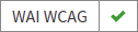
In case your page has some technical accessibility violations, you should see the following indicator where the number indicates the different violation categories for the page that you are looking at:
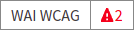
You can see the different inaccessible elements indicated by this tool by clicking the indicator when a side panel is opened displaying the different violation categories and the different elements that have violations in these categories. The inaccessible elements should be highlighted on the page when the side panel is open and you can jump into these elements by clicking the links in the side panel indicating the inaccessible element selectors.
The automated accessibility auditing tools only cover about 50% of the total accessibility requirements. Although a good starting point, the functionality always needs to be tested with real tools and compared to working examples. See the "Testing" section below for more information on how to test your service or the elements you are building with different accessibility tools.
Valid HTML
Always ensure the web pages have valid HTML. You can test this by copying the source of the page and pasting it into the HTML validator tool.
Some general guidelines for making the page valid HTML:
-
The page should always have only one
<main>element and one only. Avoid using this element in the partials and sub-views if the layout already wraps the page contents into this element. -
Use the
<section>element with caution but when you decide to use it, ensure it has an identifying heading element (h2-h6). -
Use the
<article>element with caution but when you decide to use it, ensure that you are semantically defining an article-level content. For example, a proposal card or a blog article teaser are not semantically articles that define "A complete, or self-contained, composition in a document, page, application, or site and that is, in principle, independently distributable or reusable, e.g. in syndication". If you are using an<article>tag, ensure you are describing the full content of the article and also defining the heading element inside the article (see the same issue for the<section>element). -
When defining an ID attribute for the elements, ensure the values of those attributes are unique on the page. E.g. when a filtering form is doubled for desktop and mobile, the doubled filtering control inside that form needs to have a unique ID in both of its parent elements. So if you are e.g. repeating the same partial multiple times on the page, make sure any ID attributes it contains are always unique in each instance of the generated HTML.
Accessibility tests
Once you are done developing some page or fixing its accessibility issues, you should add the following shared examples for the system specs of that page:
it_behaves_like "accessible page"This checks if the page passes the technical accessibility evaluation and contains valid HTML. It will also ensure that when other people are implementing changes on the pages covered by these tests, they will likely stay accessible also after the changes. Otherwise, accessibility can be easily broken as these kinds of issues can be hard to notice for code reviewers.
Avoid browser’s built-in functionality
Always avoid relying on the browser’s built-in functionality everywhere for special use cases, as they are known to have problems with the accessibility tools. Some examples of inaccessible elements built into the browsers include:
-
Built-in alert/confirm dialogs, these are not supported e.g. by all screen readers
-
Default file input elements are not translated according to the currently selected language on the page but instead the language of the browser or the operating system
-
Default
<select>elements can fail accessibility evaluations under specific devices and color schemes as they may not provide enough color contrast and this cannot be controlled through the stylesheets so they are also hard to fix -
<details>and<summary>for "toggles" or "dropdowns" because these have problems with some screen readers and these issues can be hard to fix with such special elements -
Any HTML element that has not been widely adopted (such as the mentioned
<details>and<summary>), as accessibility tools are always behind the fast pace of browser development
How to build accessible elements?
Regardless of the technology being used, a good general advice is to follow the guidelines for accessible elements by searching from the internet with "accessible X element" where you replace the "X" with what you are implementing.
Some examples of accessible elements you can find through internet searches:
Testing
Different accessibility auditors can also have varying levels of expertise, some may notice even the smallest details in your application and some may be happy as long as you fulfill the minimum requirements. Always do your best regarding accessibility which includes ensuring the website meets the necessary technical requirements and testing the service as a whole or the elements that you are building with the actual tools used by people with disabilities.
Screen readers
Screen readers are mostly used by people with visual disabilities. To test the service with a screen reader, try using it with your eyes closed or blindfolded. Common software used for screen reading includes:
-
Windows: NVDA, JAWS
-
Apple (macOS, iOS): VoiceOver
-
Linux: ORCA
-
Android: TalkBack
Voice control
Some people may need to use their devices using speech in case they have physical disabilities that make it hard for them to use the common pointing devices, such as a touch screen or a mouse. To test the service with voice control, try using it without a keyboard, mouse, or touch screen, just by using your mouth to speak. Common software used for voice control includes:
-
Windows: Speech Recognition (built-in some Windows versions, limited language support)
-
Apple (macOS, iOS): Voice Control
-
Chrome browser: Speech Recognition Anywhere
-
Linux: Varies, just use browser extensions
-
Android: Voice Access