Appearance
Understand the basics
In this page you can configure the look and feel of your Decidim instance.
| Please mind that this would be incompatible with some of the changes that your implementers could make in your general installation. For instance if there were changes in the Styles some parameters couldn’t be applied as expected. |
Configuration
Edit homepage appearance
This section allows to provide a general description about the instance, and to configure a call to action button that can be shown to participants on the homepage to encourage them to go to a specific process, like a proposal component where they can participate.
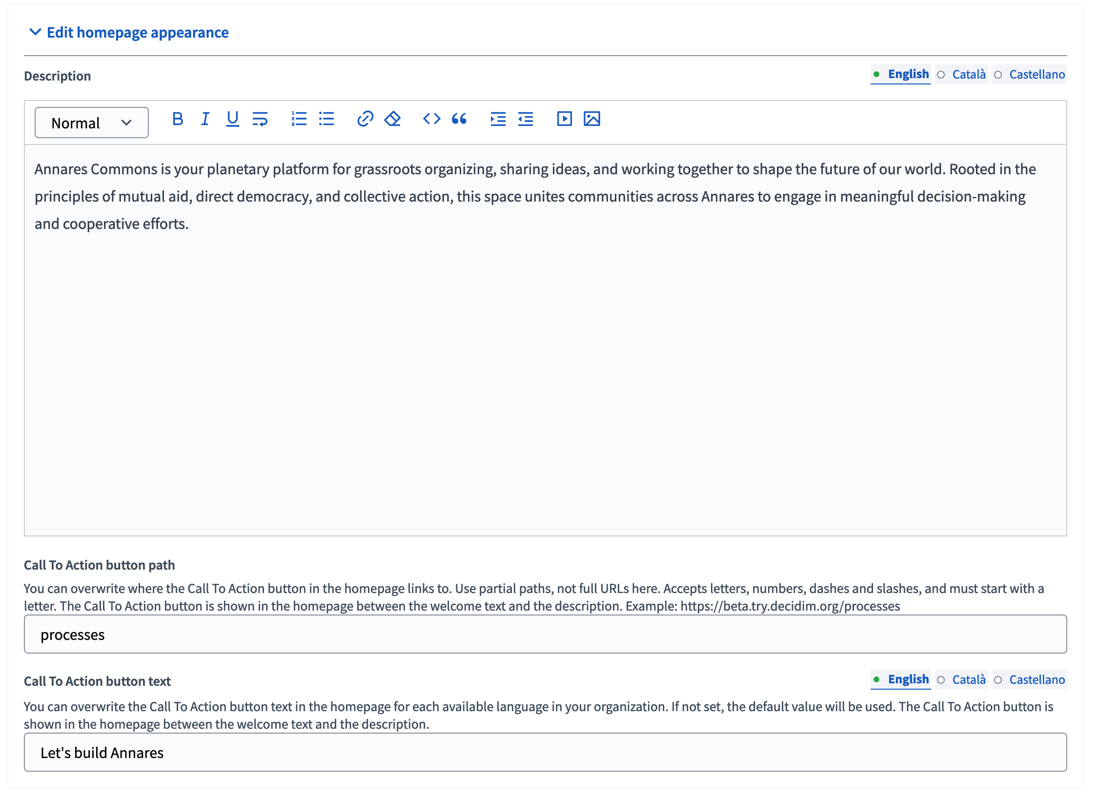
| Field | Type | Description | Visibility |
|---|---|---|---|
Description |
Optional |
The description of this instance, used for meta tags for Google and Twitter embeds. |
Visible in the footer and in the "Sub hero banner" content block in homepage if this block is enabled. |
Call To Action button path |
Optional |
Path to the place on the platform when you want to quickly redirect participants. |
Visible in the "Hero image and CTA" content block in homepage if this block is enabled. |
Call To Action button text |
Optional |
Text displayed on the CTA button. |
Visible in the "Hero image and CTA" content block in homepage if this block is enabled. |
| To understand how to enable the different homepage blocks, go to the homepage article. |
Highlighted content banner
This section allows to enable and give a description and CTA button to a banner, for example to highlight a specific space on your instance, to encourage users to create an account or to register to a meeting. You can make it evolve depending on the actuality of your instance, and deactivate it when it’s not needed.
| To appear on the homepage, the "Highlighted content banner" content block needs to be enabled on the homepage. |
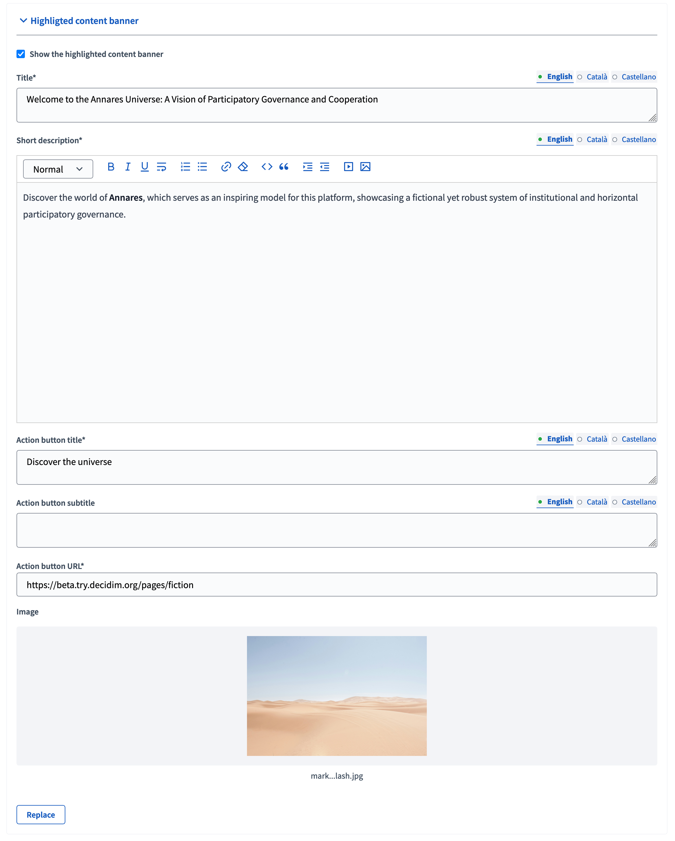
| Field | Type | Description |
|---|---|---|
Show the highlighted content banner |
Checkbox |
When checked, the highlighted content banner appears on the homepage if the "Highlighted content banner" content block is also enabled. |
Title |
Required |
The title of the banner. |
Short description |
Required |
The description for the banner. |
Action button title |
Required |
The text displayed in the banner CTA. |
Action button subtitle |
Optional |
An optional subtitle displayed in your CTA. |
Action button URL |
Required |
The URL where the CTA button redirects. |
Image |
Optional |
The background image for the banner. |
Edit omnipresent banner
This section allows to enable a banner at the top of your instance, above the headers, visible at any time from every page. It can be useful to display very important information that all participants need to see, like announcing a maintenance date, availability of a process results, an important notice, etc.
| This banner is configured on this page only, and doesn’t need to be enabled in the homepage section. |
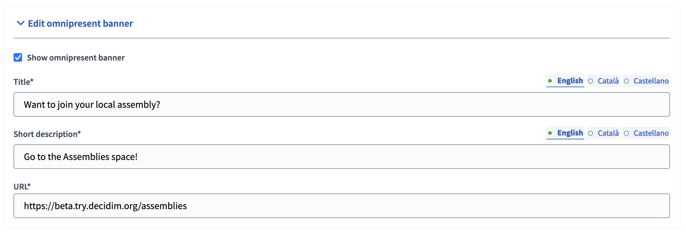
| Field | Type | Description |
|---|---|---|
Show omnipresent banner |
Checkbox |
When checked, the omnipresent banner appears at the top of each page of the platform, above the headers. |
Title |
Required |
The title of the banner. |
Short description |
Required |
The description for the banner. |
URL |
Required |
The URL where the banner redirects. |

Edit layout appearance
This section allows to download logos and icons, to be displayed in the header and footer, notification emails, newsletters, etc.
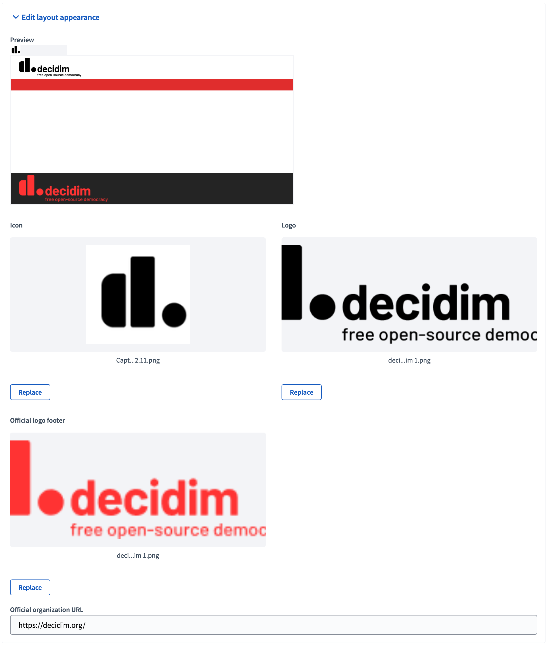
| Field | Type | Description |
|---|---|---|
Icon |
Download |
Displayed as a "favicon" in the browser tabs of the instance. |
Logo |
Download |
Displayed in the header of the instance, and the header of the newsletter and notification emails. |
Official logo footer |
Download |
Displayed in the footer of the instance, and redirects to the official organization URL. |
Official organization URL |
Optional |
The URL where the official logo footer redirects. |

Organization colors
This section allows to choose colors for the organization.
| Be aware of potential accessibility issues, for instance with people that doesn’t have a good contrast notion. You can check the contrast of your choosing with WebAIM Contrast Checker or other similar tools. |
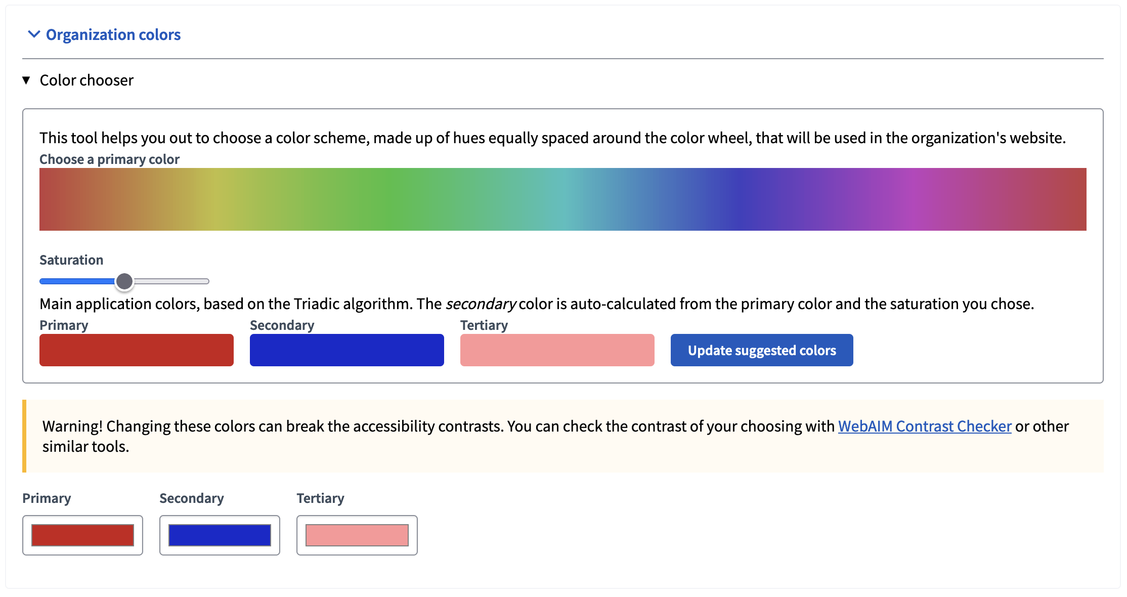
You can configure:
-
Primary color: Used for global menu background, components menu backgrounds, etc.
-
Secondary color: Used for titles links, primary buttons, header font color, etc.
-
Tertiary color: Used for titles underlines, card border color, etc.
In the following screenshot, the three different colors are displayed.

Header snippets
| You might not see this field. For more information on how to enable it, see the Styles documentation. |
This field allows to add code to the HTML head. The most common use is to integrate third-party services that require some extra JavaScript or CSS. Also, you can use it to add extra meta tags to the HTML. Note that this is only rendered in public pages, not in the administration.