Components
Understand the basics
As explained in the introduction page, to understand how Decidim works, you need to distinguish between spaces and components. The participatory spaces are the channels that citizens can participate through when public decisions are being taken, whereas participatory components are mechanisms that enable interaction between users of the platform and the various participatory spaces.
All components can be enabled in each space, for example you can enable three Proposals components in a same participatory process, or having all the components enabled in an assembly space.
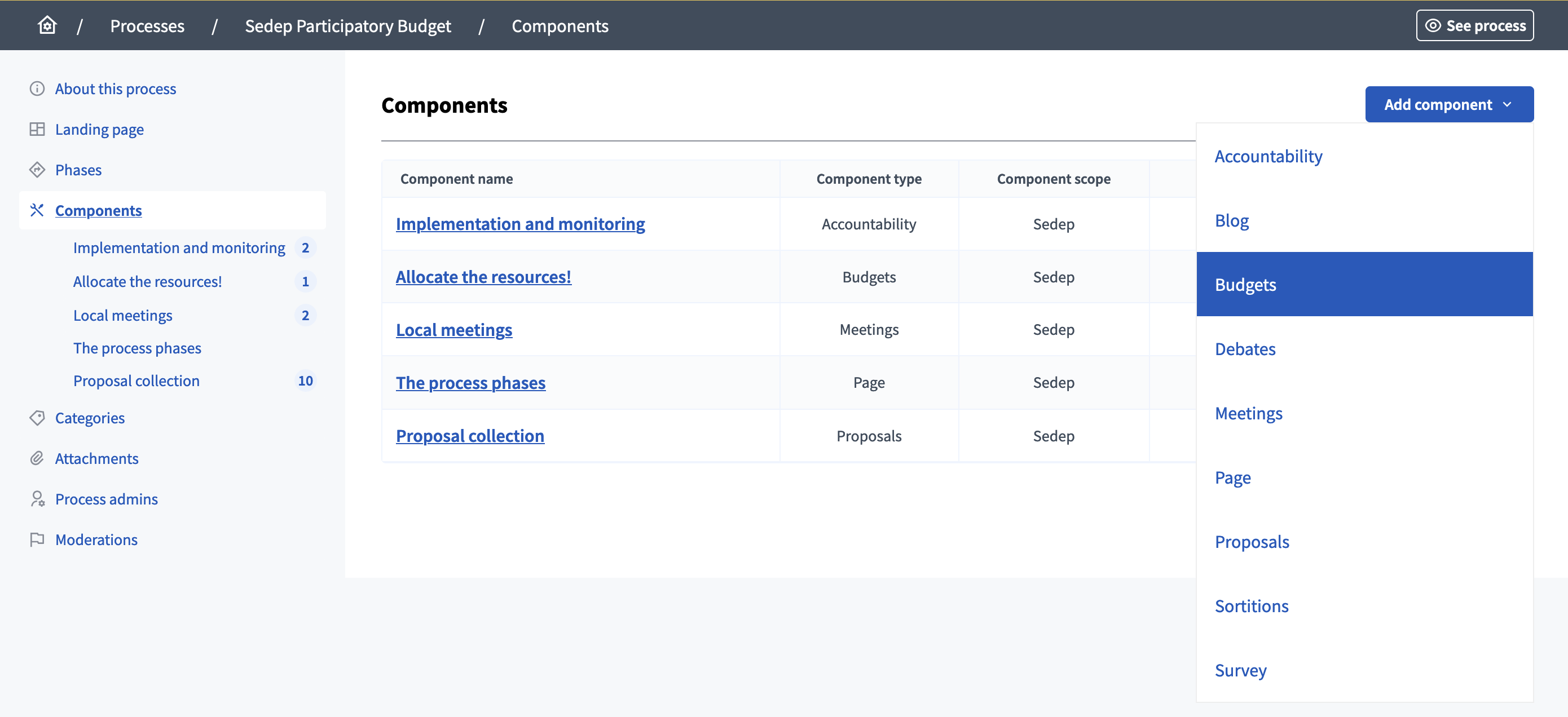
The platform currently has the following official components:
-
Accountability: allows to keep track of ongoing projects.
-
Blog: allows administrators to publish blog posts and news.
-
Budgets: allows participants to vote for projects with amounts predefined, for participatory budgeting for example.
-
Debates: allows participants to have debates.
-
Meetings: in person or online gatherings, agenda, minutes, etc.
-
Page: static pages with multi-language support.
-
Proposals: contributions posted by participants.
-
Sortitions: allows to randomly select proposals.
-
Survey: for conducting surveys with different kinds of questions.
| In the cases where your needs aren’t covered by one of those components, you can create your own component through a Module. |
Configuration
Manage components
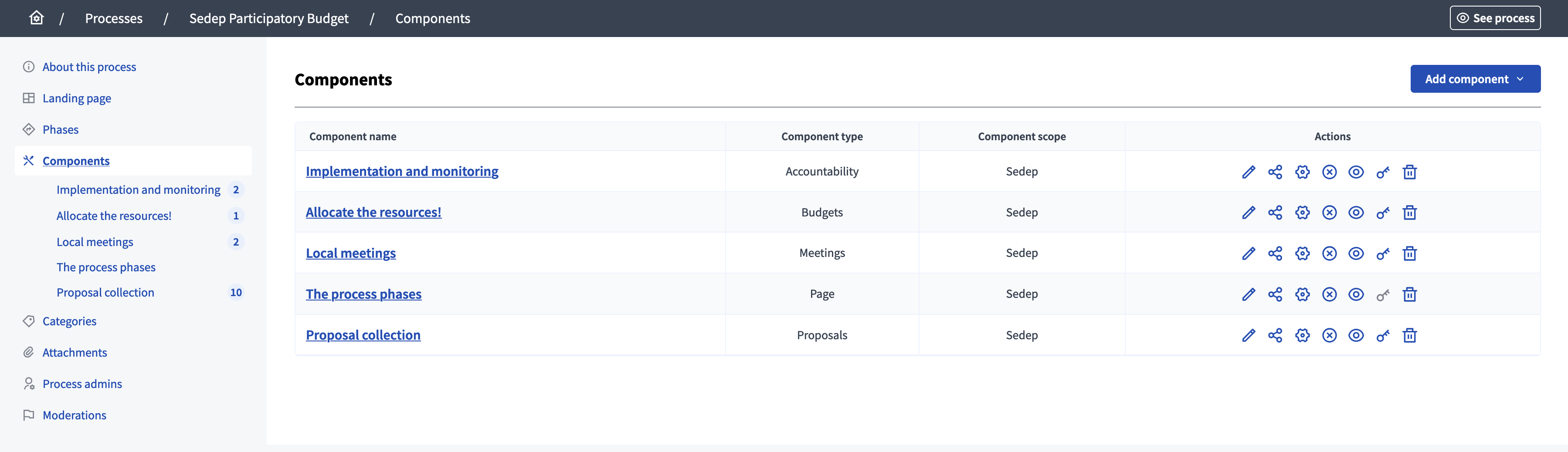
You can find all the components on the list in the administration panel, with:
-
Component name: title of the component, given when creating or editing it.
-
Component type: type of the component.
-
Component scope: in a same space, components can have different scopes.
Create a component
To configure a new component, click the Add component from the upper right part of the screen and select the type of component you want.
Actions
| Icon | Name | Definition |
|---|---|---|
|
Manage |
To manage all the resources inside of a component. For instance, all the Proposals of a Proposal component, the Meetings in a Meeting component, etc. |
|
Share |
To share privately before publishing this component. Useful for getting reviews from other people of your organization. |
|
Configure |
To configure a component with specific rules, for instance, in the case of Meetings: are comments enabled, participants can create meetings or not, etc. |
|
Publish |
To publish a component. This means that the component is then visible to the public. |
|
Unpublish |
To unpublish a component. This means that the component is then invisible to the public. |
|
Preview |
To preview the space before it’s published. |
|
Permissions |
To configure which Authorization is necessary to make certain actions in this component. For instance, in the case of Proposals, which Verification is needed to create a new proposal or to give supports. |
|
Delete |
To delete this component. If there are content inside, most of the components don’t let you delete them so it doesn’t break relations with other resources. In those cases it’s recommended to just unpublish the component. |