Components
Understand the basics
Through components an administrator can enable and configure different participatory mechanisms. All components are available in all the different spaces.
When you create a participatory space, by default, it won’t have any components in it.
The platform currently has the following official components:
-
Accountability: allows to keep track of ongoing projects.
-
Blog: allows administrators to publish blog posts and news.
-
Budgets: allows participants to vote for projects with amounts predefined, for participatory budgeting for example.
-
Debates: allows participants to have debates.
-
Meetings: in person or online gatherings, agenda, minutes, etc.
-
Page: static pages with multi-language support.
-
Proposals: contributions posted by participants.
-
Sortitions: allows to randomly select proposals.
-
Survey: for conducting surveys with different kinds of questions.
| In the cases where your needs aren’t covered by one of those components, you can create your own component through a Module. |
How to find it?
Components are accessible in each space, through the administration secondary navigation bar.
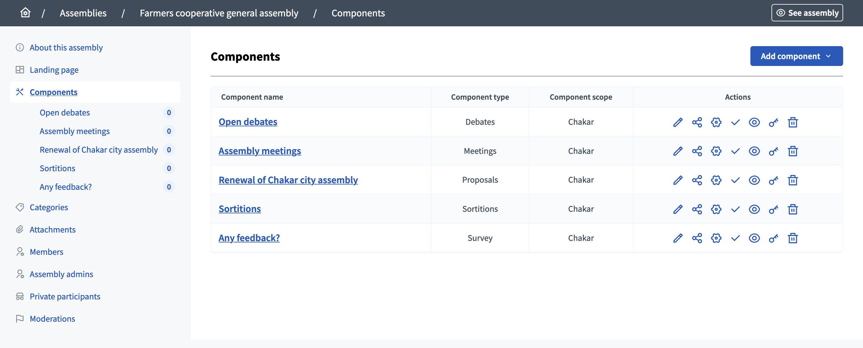
To create a component, click the "Add component" button and select the type of component you want to create.
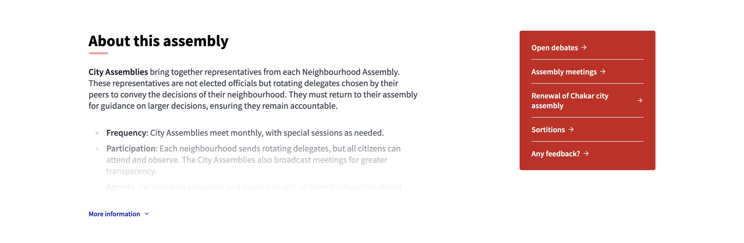
Once you start publishing components, participants see links to the different components appear in the space "Main data" content block in the landing page, in the general search engine, and in the dedicated homepage content blocks.
Configuration
Manage components
On this page, you are able to manage components and create new ones.
You can find all the components of the space on the list, with:
-
Component name: title of the component, chosen at its creation and editable.
-
Component type: type of component.
-
Component scope: the scope of the component.
Actions
| Icon | Name | Definition |
|---|---|---|
|
Manage |
To edit the resources inside the component, like blog posts, proposals, meetings, etc. |
|
Share |
Creates a link with a token to share the component with other users. |
|
Configure |
To edit the general configuration of the component. |
|
Publish |
To publish the component. |
|
Unpublish |
To unpublish the component. |
|
Preview |
Preview of how the component looks in the user interface. |
|
Permissions |
To configure which kind of Authorizations a participant need to have to be able to perform certain actions in a component. |
|
Delete |
To delete the component, only possible when there is no participant participation in it. |