Fonctionnalités
En bref
Grâce aux fonctionnalités, unx administrateur·ice peut activer et configurer différents mécanismes de participation. Toutes les fonctionnalités sont disponibles dans tous les différents espaces.
Lors de la création d’un espace participatif, l’espace, par défaut, n’aura aucune fonctionnalité.
La plateforme contient actuellement les fonctionnalités officielles suivantes :
-
Suivi : permet de garder une trace des projets en cours.
-
Actualité : permet aux admins de publier des articles et des actualités.
-
Budgets : permet aux participant·e·x·s de voter pour un projet avec une somme prédéfinie, pour un budget participatif, par exemple.
-
Débats : permet aux participant·e·x·s d’avoir des débats.
-
Rencontres : en personne ou en ligne, réunions, agenda, procès verbal, etc.
-
Page : pages statiques avec support multilingue.
-
Propositions : contributions postées par les participant·e·x·s.
-
Tirage au sort : permet de sélectionner aléatoirement les propositions.
-
Enquête : pour mener des enquêtes avec différents types de questions.
| Dans les cas où vos besoins ne sont pas couverts par l’une de ces fonctionnalités, vous pouvez créer votre propre composant via un Module. |
How to find it?
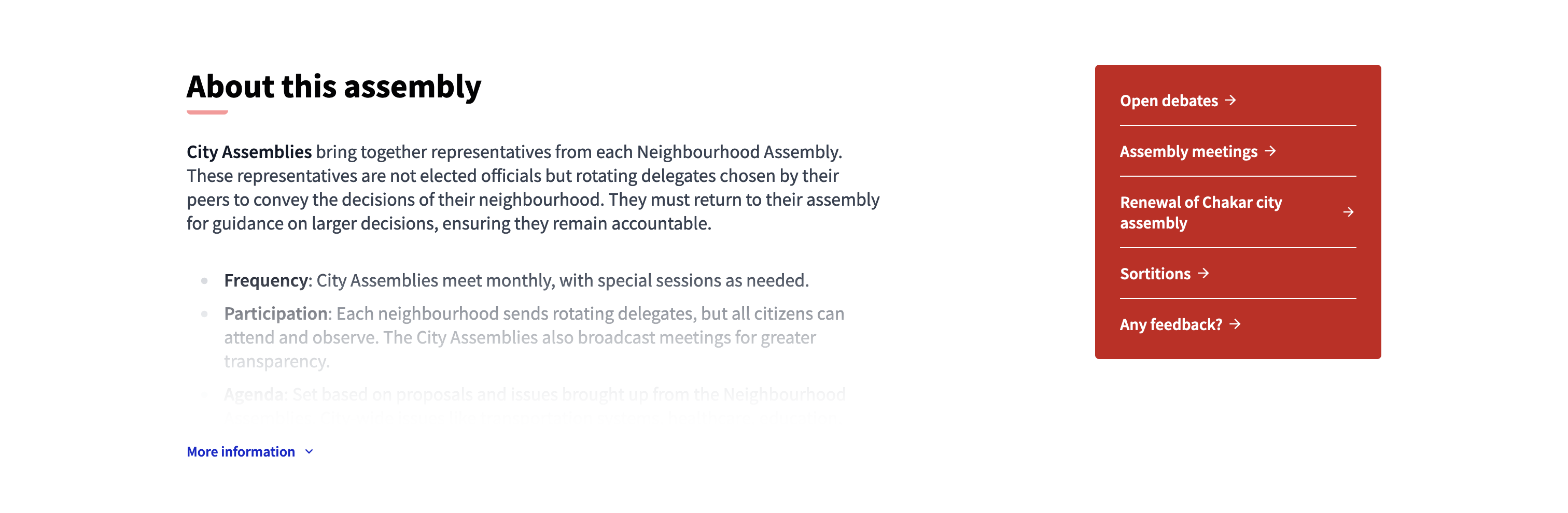
Les fonctionnalités sont atteignables dans chaque espace, en passant par la barre de navigation secondaire de l’administration.
POur créer une fonctionnalité, cliquer sur "Ajouter fonctionnalité" et sélectionner le type de fonctionnalité à créer.
Une fois la publication de fonctionnalités entamée, les participant·e·x·s voient les liens des différentes fonctionnalités apparaitre dans l’espace du bloc de contenu "Données principales" dans la page d’accueil, dans le moteur de recherche général et dansde bloc de contenu de la page d’accueil dédiée.
Configuration
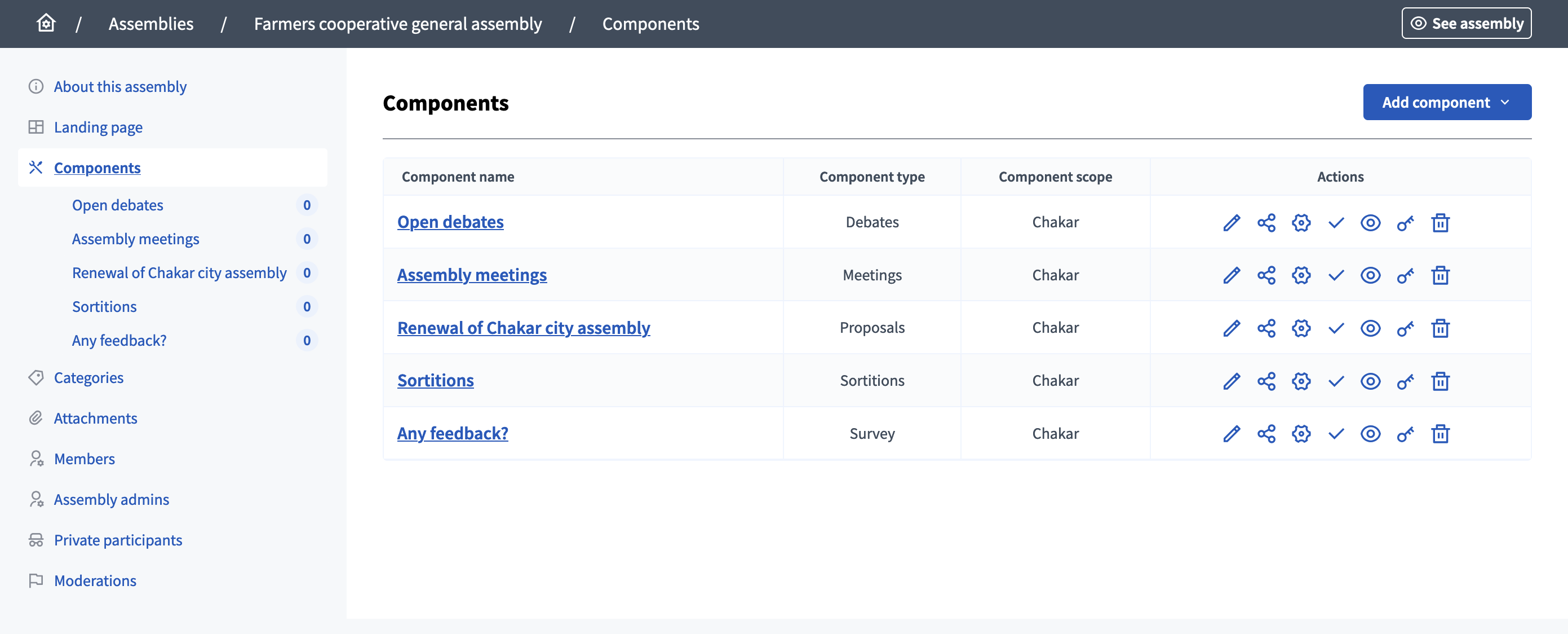
Gérer les fonctionnalités
Sur cette page, il est possible de gérer les fonctionnalités et d’en créer de nouvelles.
Les fonctionnalités de l’espace se trouvent dans la liste, avec :
-
Nom de la fonctionnalité : le titre de la fonctionnalité choisi à sa création et modifiable.
-
Le type de fonctionnalité : le type de la fonctionnalité.
-
Le secteur de la fonctionnalité : le secteur de la fonctionnalité.
Actions
| Icône | Nom | Définition |
|---|---|---|
|
Gérer |
Pour modifier les ressources internes de la fonctionnalité, comme les posts d’actualité, les propositions, les rencontres, etc. |
|
Partager |
Crée un lien avec un token pour partager la fonctionnalité avec d’autres utilisateur·ices. |
|
Configurer |
Pour modifier la configuration générale de la fonctionnilité. |
|
Publier |
Pour publier la fonctionnalité. |
|
Dépublier |
Pour dépublier la focntionnalité. |
|
Aperçu |
Aperçu de l’apparence de la fonctionnalité dans l’interface utilisateur·ice. |
|
Autorisations |
Pour configurer les types d’Autorisations que les participant·e·x·s doivent obtenir pour pouvoir mener certaines actions dans la fonctionnalité. |
|
Supprimez |
Pour supprimer la fonctionnalité, seulement possible lorsqu’auncunx participant·e·x n’y participe. |